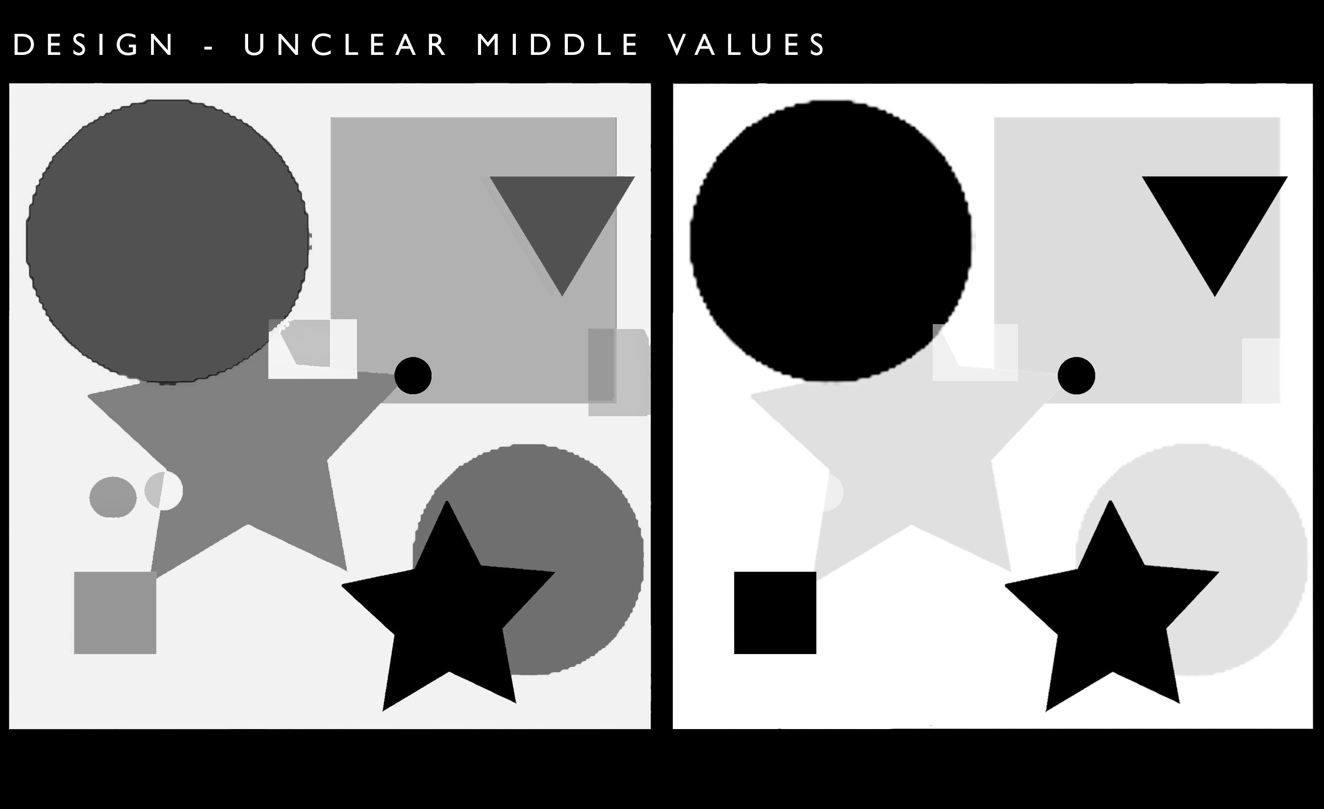

Using “clearly dark” and “clearly light” values in your art, especially in the beginning stages, makes it easier for you (and the viewer) to see the design. If a strong dark is next to a strong light, those two values will complement each other. If a lot of values are the same, or mid-range, then the art loses some of it’s visual power. Value contrast is one of the most powerful, and easiest differences we can use in our art. In the diagram below, see how the left side is visually confusing, whereas on the right side we can see how the artist curated, and decided what she/he wants us to see first. On the right there is a visual hierarchy.